|
|
Post by The Senator on Jun 20, 2009 17:23:16 GMT -5
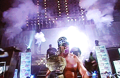
I like that its simple but effective looking. The only thing that I don't like is the placement of Senator's pic but its something that you can't really deal with since it's a triple threat match. Pff, I like where my pics at on there...right on top of the title. Nice work on the banners and poster here:) |
|
|
|
Post by Jonny Spade on Jun 20, 2009 21:48:16 GMT -5
Im just saying as a Designers perspecitve Sennie, it seems out of place a little.
|
|
|
|
Post by rosslambert on Jun 21, 2009 9:34:38 GMT -5
Jake Steele... Thunderkiss... The Third Blind Mouse.
|
|
Jason Freeman
Competition Judge
Long Island Iced Free
Posts: 3,271
|
Post by Jason Freeman on Jun 21, 2009 13:50:00 GMT -5
Why do all their nicknames have quotations after but not before?
|
|
|
|
Post by rep on Jun 21, 2009 13:57:50 GMT -5
That's the way the font was. There are quotations but you can't really see them.
|
|
|
|
Post by Thunderkiss on Jun 21, 2009 14:09:56 GMT -5
I prefer these.
I like Rep's attention to detail. Anyone else would have used red/yellow for TK and just said, "meh, fuck it." Rep actually switched the colors. And it's just not my stuff. The wrestlers show up more clearer.
|
|
|
|
Post by Jack Jefferson on Jun 21, 2009 14:17:50 GMT -5
I'm very impressed with these, and the poster is cool also. Lack of Jefferson vs. Lycos vs. Black ftl!!  |
|
Jason Freeman
Competition Judge
Long Island Iced Free
Posts: 3,271
|
Post by Jason Freeman on Jun 21, 2009 17:11:16 GMT -5
Anyone else would have used red/yellow for TK and just said, "meh, fuck it." Rep actually switched the colors. What? 0_0 That's NWO Hogan he didnt switch colors... |
|
|
|
Post by rep on Jun 21, 2009 17:15:26 GMT -5
No, it was red and yellow Hogan. I altered the color.
|
|
|
|
Post by sunnycrisis on Jun 21, 2009 18:03:17 GMT -5
These are ill, Rep. If you need someone to collaborate with or anything, get me, I've had a lot of experience with Photoshop. Unlike so many of the banners here, the OE posters here are great, simplicity, but with a ton of effort involved. Simple and classy. Totally my stee.
|
|
Jason Freeman
Competition Judge
Long Island Iced Free
Posts: 3,271
|
Post by Jason Freeman on Jun 21, 2009 19:18:15 GMT -5
No, it was red and yellow Hogan. I altered the color. OH! I take that back then. Nice job. I really love the logo above all |
|
|
|
Post by Dalton on Jun 21, 2009 21:07:02 GMT -5
These are ill, Rep. If you need someone to collaborate with or anything, get me, I've had a lot of experience with Photoshop. Unlike so many of the banners here, the OE posters here are great, simplicity, but with a ton of effort involved. Simple and classy. Totally my stee. I love how modest the new guy is  |
|
|
|
Post by Jonny Spade on Jun 21, 2009 21:25:33 GMT -5
These are ill, Rep. If you need someone to collaborate with or anything, get me, I've had a lot of experience with Photoshop. Unlike so many of the banners here, the OE posters here are great, simplicity, but with a ton of effort involved. Simple and classy. Totally my stee. I love how modest the new guy is lol |
|
|
|
Post by sunnycrisis on Jun 21, 2009 23:27:12 GMT -5
Fuck all ya'll.
Swaggin.
~~~~~~
|
|
|
|
Post by Dan White on Jun 21, 2009 23:29:18 GMT -5
Fuck all ya'll. Swaggin. ~~~~~~ Dude, are you actually gonna e-fed here, or something? Cos we're an e-fed, not a general social board for anyone to sign up to and post whenever they want. |
|